
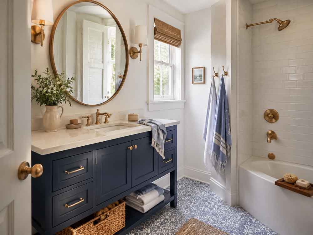
Decorating with blue can be quiet and calming, crisp and refreshing, or dark and dramatic. Pale blue can make a room feel open and breezy, while navy can lend the same space a sense of intimacy and sophistication. Somewhere between the two are dozens of shades that feel relaxed, cheerful, traditional, contemporary, or comfortably lived-in.
Part of blue’s appeal comes from its familiarity. It surrounds us in the natural world, from expansive skies and deep oceans to blue-green leaves and hazy mountain views. That connection gives blue an inherent sense of ease, making it a color many people feel comfortable living with over time.
Its versatility also allows blue to play nearly any role in a decorating scheme. It can replace gray or beige as a room’s primary neutral, bring personality to cabinetry or upholstered furniture, or appear in smaller touches that enliven an otherwise simple space. Whether you are ready to paint an entire room or simply want to add a few blue accessories, understanding how the color responds to light, materials, and neighboring hues will help you use it with confidence.
Understanding Blue Before You Decorate
Although blue is generally classified as a cool color, not every blue feels equally cool. Its undertones can push it toward green, violet, gray, or even a slightly warmer, red-leaning direction. These subtle differences have an enormous effect on how a shade looks and feels in a room.
Green-leaning blues, including aqua, teal, turquoise, and many coastal blues, tend to feel fresh, lively, and connected to nature. They work especially well with warm whites, sandy neutrals, natural wood, and woven materials. Violet-leaning blues, such as periwinkle and certain shades of indigo, can feel more romantic, formal, or expressive. Gray-blue shades are quieter and easier to use as neutrals, while clear, highly saturated blues bring more energy and contrast.
The intensity of a blue matters just as much as its undertone. A soft, grayed blue may create a subtle backdrop that recedes behind furniture and artwork. A clear cobalt or royal blue will command attention, even when used in a relatively small amount. Dark blues can feel grounding and enveloping, while pale blues often create the impression of openness.
Before choosing a shade, decide how you want the room to feel. If you are hoping for an airy and peaceful space, look toward pale sky, powder, or misty blue. For something relaxed and familiar, consider denim or cornflower. Slate blue offers an understated sophistication, while navy and midnight blue create depth and drama. Beginning with the desired mood will help narrow what can otherwise feel like an overwhelming number of choices.
The Many Shades of Blue—and What They Do in a Room
Pale sky blue is one of the lightest and most approachable ways to decorate with the color. It visually recedes, helping walls feel farther away and rooms seem more expansive. In bright natural light, it can feel clean and refreshing. In softer light, it may take on a delicate gray cast that makes it especially restful.
Powder blue has a similarly gentle quality but often feels a little more polished. It can soften a formal room, bring quiet color to a bedroom, or make painted cabinetry feel lighter than traditional navy. When paired with warm white, walnut, or antique brass, it feels elegant rather than overly sweet.
Aqua, robin’s-egg blue, and blue-green shades bring more noticeable freshness. These colors are naturally lively, but they can still feel serene when their saturation is softened. They pair beautifully with sandy beige, terra-cotta, rattan, pale oak, and creamy white, making them useful beyond strictly coastal decorating.
Cornflower and denim blue occupy a particularly livable middle ground. They are colorful without feeling demanding and familiar without becoming predictable. Denim blue works much like the fabric itself: it coordinates easily with brown, cream, black, red, green, and countless other colors. These medium blues are especially effective on upholstery, textiles, cabinetry, and casual furniture.
Cobalt and royal blue are brighter and more energetic. Because they carry so much visual weight, even a small amount can become a focal point. A cobalt lamp, glossy side table, patterned rug, or collection of blue-and-white ceramics can awaken a neutral room without requiring a larger commitment.
Slate, steel, and smoky blue are among the easiest shades to use in place of gray. Their muted quality allows them to sit quietly in the background while still giving a room more character than a conventional neutral. They are particularly effective in spaces with natural wood, stone, linen, leather, and aged metals.
Navy and midnight blue feel tailored, grounding, and timeless. Navy can be as versatile as black but often appears softer and more welcoming. Midnight blue has a more dramatic quality, especially in low light, where it can blur the boundaries of a room and create a cocooning effect.
Consider Lighting
Blue changes dramatically with the light, which is why choosing it from a small paper swatch can be misleading. The same paint color may look fresh and balanced in one room but noticeably cooler or grayer in another.
North-facing rooms typically receive cooler, indirect light. This can emphasize blue’s gray or green undertones and make an already cool shade feel chilly. That does not mean blue should be avoided in these rooms, but a slightly warmer or more saturated version may be more successful than an icy pastel.
South-facing rooms generally receive abundant, warm light throughout much of the day. This warmth can soften blue and make it feel more balanced. Medium and deeper blues often hold up particularly well in this exposure, while very pale shades may appear washed out in strong sunlight.
East-facing rooms tend to feel warmer and brighter in the morning before becoming cooler later in the day. West-facing rooms do the reverse, beginning with cooler light and becoming warmer and more golden toward evening. If a room is used primarily at a certain time, evaluate the color under the light that will matter most.
Artificial lighting also affects blue. Warm bulbs can soften the color and draw out green undertones, while cooler bulbs may make it appear sharper or grayer. Bathrooms and interior rooms with little natural light are especially dependent on their fixtures, so it is worth testing blue alongside the actual lighting that will be used.
Paint a large sample rather than relying on a small chip. Place samples on more than one wall, since the walls in a single room may receive very different amounts of light. Observe them in the morning, afternoon, and evening, both with and without the lights turned on. Blue is responsive, and taking a few days to see those changes can prevent an expensive repainting project.
Paint vs. Textile
Painting is one of the most transformative ways to introduce blue, but it is not always the best starting point. The right approach depends on how much color you want, how permanent you want the change to feel, and which surfaces already dominate the room.
Blue walls create an immersive effect. A pale blue can establish a light, atmospheric backdrop, while a deep blue can wrap the room in color. Painting cabinetry, built-ins, doors, or trim offers another option, providing a strong visual statement without covering every wall.
Textiles introduce blue more gently. Fabric absorbs light rather than reflecting it as a painted surface does, which can make even vivid shades feel softer and easier to live with. Curtains, upholstery, rugs, bedding, towels, and pillows also bring pattern and texture into the room, preventing the color from feeling flat.
There is no need to choose exclusively between paint and fabric. Some of the most interesting rooms combine several forms of blue. A smoky blue wall might be paired with darker navy upholstery, faded denim pillows, and a patterned rug containing small touches of cobalt. The colors do not have to match. In fact, varying the shades usually gives a room more depth and keeps the scheme from appearing overly coordinated.
Blue as a Neutral vs. Blue as an Accent
Blue can perform very different roles depending on its shade and how much of it is used. Muted blues such as slate, denim, smoky blue, and soft navy can function as neutrals. They provide a foundation for the room without demanding that every other element coordinate precisely with them.
A denim-blue sofa, for example, can be nearly as adaptable as a beige or gray one. It works with ivory, camel, rust, red, green, black, and natural wood. Similarly, navy cabinetry can act as a grounding neutral in a kitchen, pairing easily with white, gray, wood, stone, and a range of metal finishes.
Brighter blues work especially well as accents. Cobalt, turquoise, and royal blue draw the eye, making them useful for lamps, artwork, chairs, tile, or decorative objects. A small amount can give an otherwise quiet room a distinct point of view.
To decide which approach is right, consider how strongly you want to experience the color. If blue consistently appears in your wardrobe, artwork, and favorite interiors, you may be comfortable using it as a foundation. If you enjoy blue but frequently change your decorating preferences, begin with accessories or textiles that can be moved and replaced more easily.
Color Palettes That Pair Beautifully with Blue

Blue & Cream
Blue and creamy, warm white form one of the most timeless decorating combinations. The white keeps blue feeling crisp, while a creamy undertone prevents the palette from becoming stark. Add natural wood, linen, jute, or rattan to make the scheme feel warmer and more relaxed.

Blue & Gray
Blue and gray can be serene and sophisticated, but their undertones need careful attention. A warm, violet-gray may clash with a green-leaning blue, while two cool, muted shades may feel flat without a warmer element. Wood, leather, brass, or even a small amount of ochre can bring balance.

Blue & Camel
Blue also pairs naturally with tan, camel, and brown. These earthy colors offset blue’s coolness, producing a grounded, comfortable palette. Navy upholstery with cognac leather is a classic example, as is a pale blue wall furnished with warm oak or walnut.

Blue & Green
Blue and green create a layered, nature-inspired effect. Sage and dusty blue feel quiet and restful, while emerald and navy make a richer statement. Because blue and green sit beside each other on the color wheel, they blend easily and can be combined in several shades without appearing overly busy.

Blue & Yellow
For more contrast, pair blue with yellow. Powder blue and butter yellow feel lighthearted and nostalgic, while navy and ochre create a more substantial, sophisticated look. Blue and terra-cotta offer another warm-cool balance, with the earthy orange tones making blue feel deeper and more vibrant.

Blue & Reds
Blush, dusty rose, and muted coral can soften dark or saturated blues. Red produces a bolder result, especially when used with crisp white, but it does not have to feel nautical or patriotic. Choosing softened shades—such as brick red with denim blue—creates a more collected effect.

Blue & Black
Blue can even be paired with black. Against pale blue, black adds definition and keeps the room from feeling overly delicate. With navy or cobalt, it creates a strong, modern combination. The key is including enough variation in texture and value so that the darker colors do not merge into one heavy mass.
Decorating with Blue, Room by Room
The Kitchen

Blue has become a natural fit for the kitchen because it provides a colorful alternative to white or gray cabinetry without sacrificing versatility. Navy cabinets feel classic and tailored, blue-gray cabinets are quiet and understated, and medium denim shades create a more casual, welcoming mood.
For a less expansive application, paint only the island blue and keep the perimeter cabinets neutral. This turns the island into a focal point while allowing the kitchen to remain light. A pantry door, hutch, freestanding cabinet, or bank of lower cabinets can create a similar effect.
The materials paired with blue will shape the kitchen’s overall character. Navy with bright white counters and polished chrome feels crisp and refined. The same navy combined with walnut, soapstone, and aged brass feels warmer and more traditional. Powder blue with pale oak and creamy tile can make the space feel fresh and relaxed, while cobalt accents bring lively personality to a mostly neutral kitchen.
Blue can also be introduced through tile, counter stools, café curtains, runners, cookware, and dishware. A blue backsplash is a particularly effective way to add color because the variation and shine of tile prevent the surface from looking flat. If you are using several blue elements, allow the shades to vary rather than trying to match them perfectly.
Because kitchens are hardworking spaces, durability is as important as color. Choose washable wall paint and a cabinet finish designed to withstand repeated touching, moisture, and cleaning.
The Living Room

In a living room, blue can be either a calm backdrop or the room’s central statement. Pale blue walls are easy to live with and can visually expand a smaller space. Deep blue walls create more intimacy, making a large room feel cozier and giving artwork, pale upholstery, and warm wood greater presence.
A blue sofa or armchair offers color without committing to painted walls. Navy and denim upholstery are especially forgiving in busy households because they conceal everyday wear better than many pale neutrals. They also coordinate with a wide range of changing accent colors, allowing pillows and throws to be updated over time.
For a layered look, repeat blue in different materials and values. Pair a navy sofa with a faded blue rug, patterned pillows, blue-and-white ceramics, and artwork that includes a small amount of the same color. Repetition helps the blue feel connected to the room, while variation keeps it from looking like a matching furniture set.
Warm materials are particularly useful in blue living rooms. Leather, wood, woven baskets, linen, bouclé, and brass bring tactile richness and prevent the palette from feeling cool or one-dimensional. Greenery also works beautifully with blue, adding another natural color that makes the room feel relaxed and alive.
The Bedroom

Blue’s association with calm makes it an obvious choice for bedrooms, but the effect changes considerably with the shade. Pale, hazy blues create a quiet and airy retreat. Medium denim and slate shades feel comfortable and grounded. Navy, indigo, and midnight blue can turn the room into an enveloping sanctuary.
An all-blue bedroom does not require every element to be identical. Tonal layering is usually more effective. Begin with one main shade on the walls or bedding, then add lighter and darker versions through an upholstered headboard, curtains, pillows, a bench, or a patterned rug. This creates depth while preserving the soothing character of the palette.
If dark walls feel like too much of a commitment, use blue behind the bed as a focal point, either through paint, wallpaper, or a substantial upholstered headboard. Blue bedding is another simple way to establish the color, particularly when layered with ivory sheets, a textured white coverlet, or a camel-colored throw.
Warmth matters in the bedroom, especially when the space receives limited natural light. Wood nightstands, woven shades, antique brass, creamy textiles, and small touches of rust or ochre can keep blue from becoming chilly. Soft, warm lighting will reinforce the restful mood after dark.
The Bathroom

Blue feels at home in the bathroom because of its connection to water, but that does not mean the room has to look overtly coastal. The result depends on the shade, materials, and styling.
Pale watery blues paired with white tile and light wood create a clean, spa-like atmosphere. Blue-gray can soften a highly reflective bathroom filled with glass, mirrors, and polished surfaces. Navy brings contrast to white fixtures and marble, while deep teal can make a small powder room feel dramatic and jewel-like.
A painted vanity is one of the easiest ways to introduce blue without changing every surface. Tile can make a longer-lasting statement, whether it appears on the floor, in the shower, or as a backsplash. Wallpaper, towels, shower curtains, bath mats, and framed artwork offer more flexible options.
Pay close attention to lighting in bathrooms, particularly those without windows. Cool, inadequate light can make blue look dull or harsh. Test paint and material samples near the mirror and under the room’s fixtures. Also choose finishes formulated to tolerate humidity and repeated cleaning so the color continues to look fresh.
Best Blue Paint Finishes by Room
Once you have chosen a blue, selecting the right paint finish is essential. Sheen affects durability, but it also influences how the color appears. Flatter finishes absorb light and can make deep blue look velvety and immersive. Shinier finishes reflect more light, making the same color appear brighter and emphasizing variations in the wall or woodwork.
In the kitchen, washable matte or eggshell paint is generally appropriate for walls. Satin or semi-gloss is better suited to cabinetry, trim, and doors because it tolerates moisture and frequent cleaning. A satin cabinet finish gives blue a soft luster, while semi-gloss creates a more polished, reflective effect.
For living room walls, matte paint creates a soft, sophisticated appearance, particularly with deep or smoky blues. Eggshell offers slightly more durability and may be preferable in high-traffic households. Satin or semi-gloss can highlight built-ins, mantels, window trim, and other architectural features.
In the bedroom, matte or flat paint reinforces a restful atmosphere by minimizing glare. Eggshell is a practical alternative if the walls need to withstand more regular cleaning. A higher sheen can be reserved for trim or a painted furniture piece.
Bathrooms require finishes that can cope with humidity. Moisture-resistant eggshell or satin is usually the best choice for walls, while semi-gloss works well on trim, doors, and painted vanities. Always follow the paint manufacturer’s recommendations, as formulas and performance can vary.
As you compare blue paint swatches, consider more than the color name. Note each shade’s undertone, Light Reflectance Value, or LRV, and recommended finish. LRV indicates how much light a color reflects on a scale from dark to light. It can help you anticipate how much visual weight a blue will have, although it should never replace testing the color in the room itself.
Most Popular Blue Paint Colors Designers Love

Benjamin Moore Hale Navy (HC-154) – A use-anywhere shade of navy with a classic maritime feel..

Behr Charismatic Sky (M520-3) – A light blue that speaks of utter contentment and happiness..

Glidden Aqua Smoke (S340-4 – A balanced, medium green with subtle warmth. It feels fresh in living spaces and kitchens without skewing too bright.

Valspar Cottage Door (8004-38E) – A dark, grayed-out blue neutral with warm undertones.

Behr Beachside Drive (M460-2) – An ocean-inspired mix of sky blue, seafoam green and sand from the shore.
Benjamin Moore Santorini Blue (1634) – As refreshing as it is cool, this sophisticated blue features a touch of gray.

Behr Adirondack Blue (N480-5) – A stable and reassuring slate blue, that echoes the calm respite of natural settings and refined sophistication.

Benjamin Moore Ocean Air (2123-50) – A go-to blue-green for creating instantly soothing spaces.

Glidden Cavalry (PPG1041-7) – A dark, gray, twilight blue with a lavender undertone.
Decorating with Blue Without Painting
Painting is not necessary to make blue feel like a meaningful part of a room. Textiles often provide the quickest and most flexible route. A large rug, pair of curtains, duvet cover, or upholstered chair can introduce enough color to influence the entire space.
Start with one substantial item and build around it. In a neutral living room, that might be a faded blue rug. In a bedroom, it could be an indigo quilt. In a kitchen, patterned café curtains or a washable runner may be enough to establish the palette.
Smaller objects can reinforce the color. Lamps, ceramics, books, glassware, trays, artwork, and decorative boxes allow blue to travel around the room. Rather than grouping every blue object together, distribute a few touches across the space so the eye moves naturally from one to the next.
Removable wallpaper and peel-and-stick tile provide more noticeable color without the permanence of traditional materials. A freestanding dresser, side table, bench, or cabinet can also be painted blue and moved to another room later.
Even fresh flowers can introduce blue, although true blue blooms are less common than purple-blue varieties. Hydrangeas, delphiniums, grape hyacinths, and thistle-like stems add both color and organic texture. The goal is not to fill every empty surface but to repeat blue just enough that it appears intentional.
How to Keep Blue from Overwhelming a Space
Because blue is so familiar, it is easy to assume that any amount will feel restful. A highly saturated medium blue can become more visually dominant than a very dark navy or a muted blue-gray. The key is balancing the color’s intensity with the room’s size, light, and other materials.
Break up large expanses of blue with warm white, natural wood, stone, woven fibers, or warm metal. These elements provide visual relief and keep the space from feeling cold. A navy room, for instance, may need pale curtains, an ivory rug, and warm wood furniture to prevent the walls from absorbing too much light.
Avoid using one exact blue on every surface. A room with matching blue walls, upholstery, pillows, and accessories can feel flat despite the amount of color. Instead, vary the value and texture. Combine smooth painted surfaces with faded textiles, glazed ceramics, patterned fabric, or washed linen.
Bright blues are most effective when they have room to breathe. A cobalt chair or lamp will feel more special against a quieter backdrop than it will in a room filled with equally strong colors. If several saturated shades are being used, repeat them thoughtfully and include generous neutral space between them.
It is also important to edit. Once blue appears in several substantial places, every accessory does not need to reinforce the theme. Let books, art, collected objects, and natural materials introduce other colors so the room feels personal rather than designed around a single hue.
Which Shade of Blue Is Right for You?
The best blue is not necessarily the one that looks most appealing on a paint card or inspiration image. It is the shade that supports the feeling you want and works with the features already in your home.
If you want a room to feel airy, gentle, and open, begin with sky blue, powder blue, or a pale misty shade. For freshness with a little more personality, consider aqua or another green-leaning blue. Denim and cornflower are useful when you want the room to feel casual, comfortable, and easy to live with.
Slate, steel, and smoky blue suit interiors that call for quiet sophistication. These shades can replace gray while maintaining a similarly versatile character. Cobalt and royal blue are better choices when energy and contrast are the goal. Navy, indigo, and midnight blue create depth and work particularly well in rooms intended to feel intimate, tailored, or dramatic.
Look closely at the permanent elements in the space. Flooring, countertops, tile, stone, and large furniture pieces all have undertones that will affect the blue. A cool blue may emphasize orange tones in wood, which can be beautiful if contrast is desired but distracting if you were hoping for a quieter result.
Finally, sample several shades—even if you believe you have already found the right one. Paint colors viewed online or in another home will not behave exactly the same way in your space. The correct blue may be slightly grayer, warmer, darker, or less saturated than the shade that initially caught your attention.
Bringing It All Together
A successful blue room begins with a clear idea of what role the color will play. Blue might be the backdrop, covering the walls and setting the mood. It might function as a neutral through a sofa, rug, or cabinetry. Or it may appear as a focused accent that brings energy to an otherwise restrained palette.
Once that role is established, repeat the color in a few thoughtful ways. A blue wall might connect to a patterned pillow and a small detail in a piece of artwork. Navy kitchen cabinetry might be echoed by a runner or a collection of ceramics. These repeated notes create continuity without requiring exact matches.
Rooms throughout the home do not need to use the same shade of blue. A pale blue bedroom, navy kitchen, and teal powder room can still feel connected if the shades share similar undertones or are supported by recurring materials such as warm wood, creamy white, and brass.
Most importantly, allow blue to live alongside the objects and materials that make the home personal. Books, artwork, furniture collected over time, natural textures, and colors borrowed from adjoining rooms will keep the result from feeling overly themed.
Why Decorating with Blue Endures
Blue has remained a decorating favorite because it can be both dependable and expressive. It feels familiar enough to use across large surfaces, yet distinctive enough to give a room character. It can recede quietly into the background or become the element that defines the entire space.
Its connection to the natural world gives blue a timelessness that is difficult to manufacture. Trends may shift from pale coastal shades to smoky slate, vivid cobalt, or near-black navy, but blue itself never truly disappears. It simply takes on a new tone.
Whether introduced through paint, furniture, tile, fabric, or a handful of collected objects, blue has the ability to make a home feel calmer, fresher, richer, or more complete. The secret is not finding one universally perfect shade. It is choosing the blue that responds beautifully to your home’s light, complements the way you already live, and creates a room you will continue to enjoy long after the latest color trend has passed.



Leave a Reply