
A Room-by-Room Guide to Using Nature’s Most Versatile Color
Green has an unusual ability to feel both fresh and timeless. It can be crisp and modern, soft and traditional, bold and dramatic, or barely-there and neutral. In a world filled with visual noise, green grounds a space. It echoes nature, signals calm, and adds depth without demanding constant attention.
Unlike trend-driven colors that cycle in and out, decorating with green endures because it spans such a wide spectrum—from pale sage to inky forest. Used thoughtfully, it can unify an entire home or quietly elevate a single room.
This guide walks through how to understand decorating with green, how to pair it successfully, and how to use it room by room—whether you’re painting cabinets, choosing a sofa, or simply adding a few accessories.
Understanding Green Before You Decorate
Before selecting a paint chip or ordering fabric samples, it helps to understand what kind of green you’re working with. The undertone and depth of the color will influence everything from mood to lighting to how it pairs with other finishes in your home.
The Many Shades of Green (and What They Do in a Room)
Soft, muted greens (sage, eucalyptus, celadon)
These greens have gray or blue undertones and feel light and airy. They work beautifully in bedrooms, kitchens, and living spaces where you want a calm, relaxed atmosphere. Muted greens often function almost like a neutral, especially in natural light.
Mid-tone botanical greens (olive, moss, fern)
Earthier and slightly warmer, these greens feel collected and grounded. They complement wood tones exceptionally well and suit traditional, rustic, or layered interiors. Olive cabinetry or moss-toned upholstery can add warmth without veering into beige.
Deep, dramatic greens (emerald, forest, hunter)
Rich greens bring sophistication and depth. They are especially effective in dining rooms, libraries, powder rooms, and bedrooms where a cocoon-like effect is welcome. Paired with brass, marble, or black accents, they create a tailored, classic look.
Yellow-leaning greens
Brighter and more energetic, these greens feel cheerful and fresh. They’re best used as accents or in light-filled spaces where they won’t appear overly vibrant.
Blue-leaning greens
Cooler and more serene, these greens feel spa-like. They work beautifully in bathrooms and bedrooms and pair well with white tile and polished nickel.
Consider Lighting
North-facing rooms tend to pull green cooler and grayer, while south-facing rooms amplify warmth. When decorating with green (or any color, for that matter), always test large swatches on multiple walls and observe them throughout the day.
Paint vs. Textile vs. Tile
- Paint shifts significantly depending on light.
- Upholstery often appears deeper and more saturated.
- Tile reflects light and may read brighter than expected.
Sampling materials in the actual space prevents costly missteps.
Green as a Neutral vs. Green as an Accent
When Green Functions as a Neutral
Muted sage walls, olive cabinetry, or a moss-toned sofa can serve as a backdrop rather than a focal point. These shades support wood, stone, brass, and natural textiles beautifully. In this role, green replaces beige or gray but adds more dimension.
When Green Becomes the Accent
In smaller doses—an island painted deep forest, emerald bar stools, a patterned botanical wallpaper—green becomes a statement. In these cases, balance is key. Let one strong green moment anchor the room, then repeat the color subtly in smaller elements to create cohesion.
Color Palettes That Pair Beautifully with Green
Green thrives when paired thoughtfully. Here are combinations that consistently work when decorating with green::

Green + Warm Neutrals
Cream, oatmeal, warm whites, and light wood tones soften green and make it feel approachable. This pairing works especially well with sage and olive.

Green + Brass or Gold
Warm metals elevate green instantly. Brass hardware on green cabinetry or gold-framed art against forest walls adds refinement.

Green + Black and White
Crisp and graphic, this pairing feels modern. Black fixtures and white tile keep green from feeling overly traditional.

Green + Blush or Soft Pink
Blush introduces warmth and subtle contrast. The combination feels fresh and layered without being overly feminine.

Green + Navy
Deep navy adds structure and depth. Together, they create a tailored palette suitable for living rooms and offices.

Green + Terracotta or Rust
Earthy reds and warm clay tones enhance green’s natural quality. This palette feels grounded and inviting.

Monochromatic Greens
Layering multiple greens—sage walls, olive upholstery, darker green accents—creates depth without visual clutter. The key is varying tone and texture.
Decorating with Green, Room by Room
The Kitchen: Fresh, Classic, or Bold

Decorating with green in the kitchen can range from subtle to dramatic.
Cabinetry
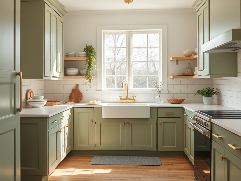
Full sage cabinetry feels soft and timeless. Olive or forest green on lower cabinets paired with white uppers keeps the room balanced. Painting only the island is a low-risk way to introduce a deeper shade.
Backsplash Tile
Glossy green subway tile adds energy. Handmade-style tiles in muted tones bring texture and warmth.
Wood Pairings
Green pairs beautifully with walnut, oak, and butcher block countertops. Warmer woods complement olive and moss, while lighter woods work well with sage.
Hardware and Fixtures
Brass hardware warms deeper greens. Matte black gives green cabinetry a contemporary edge.
Styling
Open shelves styled with green glassware, ceramics, and plants reinforce the palette without overwhelming it.
The Living Room: Layered and Inviting

A living room benefits from decorating with green because of the color’s grounding qualities.
Green Sofas
An emerald velvet sofa feels classic and dramatic. A linen sage sofa feels casual and approachable. In either case, balance it with neutral rugs and layered pillows.
Accent Walls
A deep green wall behind a fireplace or bookshelf adds depth. To keep it from feeling heavy, incorporate lighter textiles and reflective surfaces nearby.
Botanical Wallpaper
Subtle botanical prints introduce green in pattern form and work especially well in traditional or cottage-inspired spaces.
Rugs and Textiles
A green rug can anchor a neutral seating area. Mix textures—linen, wool, velvet—to keep the room dynamic.
For small living rooms, use lighter greens and maintain visual breathing room with pale ceilings and trim.
The Bedroom: Restful and Grounded

Decorating with green is ideal for bedrooms because of the color’s calming nature.
Walls
Sage and eucalyptus create a serene backdrop. Dark forest green produces a cocoon effect, particularly effective behind a bed.
Headboards and Bedding
An upholstered green headboard adds focus without committing to painted walls. Layer green bedding with cream and textured neutrals for softness.
Pattern Mixing
Florals, stripes, and subtle block prints in complementary greens add interest without overpowering the space.
In guest rooms, lighter greens feel welcoming. In primary bedrooms, deeper shades can create intimacy and sophistication.
The Bathroom: Spa-Inspired or Vintage Charm

Bathrooms are ideal spaces for decorating with green.
Tile
Green subway tile, mosaic floors, or zellige-inspired walls create visual interest and reflect light beautifully.
Vanities
A painted green vanity paired with marble countertops feels timeless. Pair with brass for warmth or matte black for contrast.
Wallpaper
Botanical wallpaper in a powder room makes a strong statement in a small footprint.
Accessories
Green towels, shower curtains, and plants allow for seasonal shifts without renovation.
Decorating with Green Without Painting
Not ready for a major commitment? Green can enter your home through styling.
- Throw pillows and blankets
- Artwork and framed botanicals
- Ceramic vases and glassware
- Table lamps and lampshades
- Area rugs
- Books and decorative objects
- Fresh plants and greenery
Seasonal shifts can be subtle. In spring and summer, choose lighter, brighter greens. In fall and winter, lean into deeper tones.
A helpful guideline: repeat green at least three times within a room—large, medium, and small scale—for balance.
Best Green Paint Finishes by Room
The finish you choose influences both durability and appearance.
- Kitchen & Bathroom Cabinets: Satin or semi-gloss for durability and easy cleaning.
- Walls in Living Areas & Bedrooms: Eggshell or matte for a soft, modern look.
- Trim & Doors: Semi-gloss to create subtle contrast.
- Powder Rooms with Deep Greens: Matte can enhance the richness, but ensure proper ventilation.
Most Popular Green Paint Colors Designers Love
While lighting and undertones matter more than brand loyalty, these greens are frequently specified because they strike a reliable balance between depth, softness, and versatility.

Sherwin-Williams Evergreen Fog (SW 9130) – A muted gray-green with modern appeal. It functions almost like a neutral in well-lit spaces.

Benjamin Moore October Mist (1495) – A soft, silvery sage that works beautifully in kitchens, bedrooms, and open-concept spaces. It reads calm without feeling washed out.

Behr Back to Nature (S340-4) – A balanced, medium green with subtle warmth. It feels fresh in living spaces and kitchens without skewing too bright.

Glidden Guacamole (PPG1121-5) – A saturated, yellow-leaning green that brings energy and personality to cabinetry, accent walls, or smaller spaces like powder rooms.

Sherwin-Williams Pewter Green (SW 6208) – A rich, earthy gray-green that pairs beautifully with brass and natural wood tones.

Benjamin Moore Essex Green (HC-188) – A deep, traditional forest green that adds instant drama to libraries, dining rooms, or cabinetry.
As always, sample generously and test on multiple walls. Observe the color in morning light, afternoon light, and under artificial lighting before committing. Green shifts more than many homeowners expect, especially in rooms with limited natural light.
How to Keep Green from Overwhelming a Space
- Break up large green surfaces with wood, stone, or open shelving.
- Mix matte and glossy finishes for depth.
- Incorporate natural textures like linen and jute.
- Use repetition to create cohesion rather than isolated color moments.
Decorating with green is the most successful when the color is integrated rather than isolated.
Which Shade of Green Is Right for You?
Consider the mood you want to create:
- If you love calm, airy interiors → Try muted sage or eucalyptus.
- If you gravitate toward warmth and wood tones → Olive or moss may suit you.
- If you prefer drama and contrast → Deep emerald or forest green.
- If your home has abundant natural light → You can explore richer tones confidently.
- If your space lacks natural light → Stick to lighter or mid-tone greens with warm undertones.
Bringing It All Together
A cohesive home doesn’t require the same shade of green everywhere. Instead, establish a color story. Perhaps sage anchors the kitchen, olive appears in the living room textiles, and forest green accents the powder room.
Repeating undertones creates flow. If your greens lean warm, continue that warmth throughout. If they skew cool, maintain that consistency.
Green’s versatility allows it to connect spaces subtly without feeling repetitive.
Why Decorating with Green Endures
Decorating with green remains relevant because it reflects the natural world. It adapts to changing styles, complements nearly every material, and ranges from barely-there to boldly expressive.
You can start small—with a pillow or painted vanity—or go all in with cabinetry or walls. Either way, green rewards thoughtful use. It grounds a space, softens sharp edges, and brings quiet vitality to the rooms where we live most fully.
When chosen with intention and balanced with texture and light, green becomes more than a color choice. It becomes the thread that ties a home together.



Leave a Reply